Momoyoga Backend Redesign (Internship)
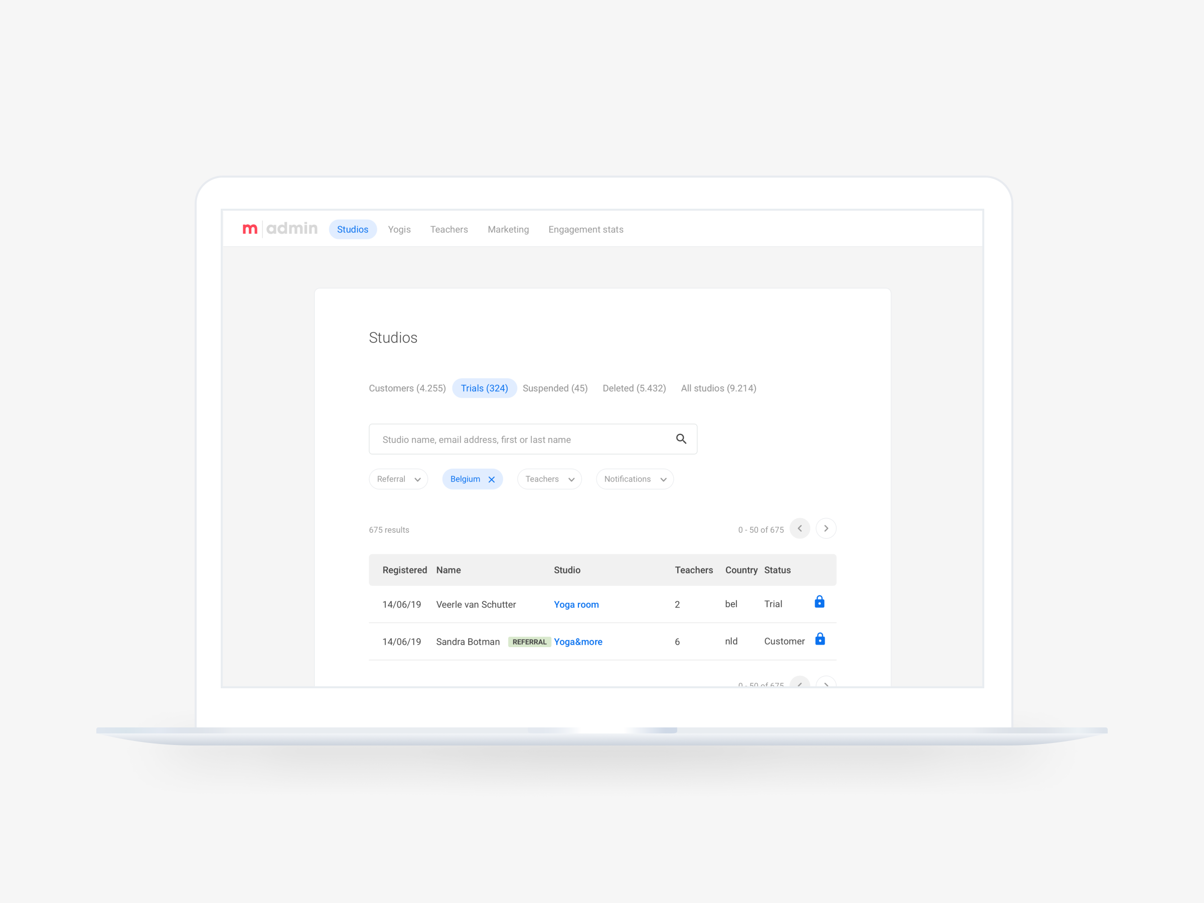
The project focused on a complete redesign of the backend system at Momoyoga, aimed at improving customer support for their yoga studio management software. The goal was to develop an intuitively understandable system, designed with future scalability and adaptability in mind.
This project spanned roughly 5 months, during which I dedicated around 50% of my time to the project as the sole designer. Throughout this period, I regularly met with the lead UX-designer/co-owner of the company for feedback sessions and status updates. Additionally, I met with customer success staff and developers to ensure the designs met their requirements and to assess the feasibility of the designs.

01. Context
Momoyoga is a software company that creates a management platform tailored to yoga studios and teachers and their needs. The company uses its knowledge of the unique requirements of the yoga community to offer a range of features, including scheduling, client management, and payment processing. Their goal is to create an intuitive tool that helps yoga studios and teachers with administrative tasks so they can spend more time on the mat doing what they love. Next to their main software, they also have a backend system only accessable for their employees. This system is mainly used to suppot customers, offering a range of functionalities designed to support the service provided to users. It serves as a critical system for managing customer inquiries and troubleshooting issues.
02. The Problem
The problem at hand stemmed from the complexity of the backend system, also called Momo Amdin, making it difficult for new employees to navigate efficiently. With each new hire, considerable time was spent acquainting them with Momo Admin, leading to potential errors and confusion in executing tasks. Moreover, as the company and its software expanded, additional features were incorporated into the system without sufficient consideration for organization or clarity. This approach resulted in a cluttered interface, making it challenging for users to locate and understand functionalities. Consequently, the primary objective of the project was to streamline the user experience for current employees and to establish a scalable, intuitive design that anticipates future feature expansions.
03. Design Process
To begin, it was important to gain a good understanding of both the software's backend functionality and the functionalities offered to customers. For this, I conducted a thorough analysis, logging initial questions and responses to ensure clarity for new users like myself. After that, I conducted walkthroughs with employees familiar with the system's daily use.
Following these initial steps, I arranged interviews with representatives from all departments to gather insights on their usage patterns, pain points, and desired improvements. This input was then used to host a collaborative brainstorming session involving four employees, generating ideas for new features and improvements.
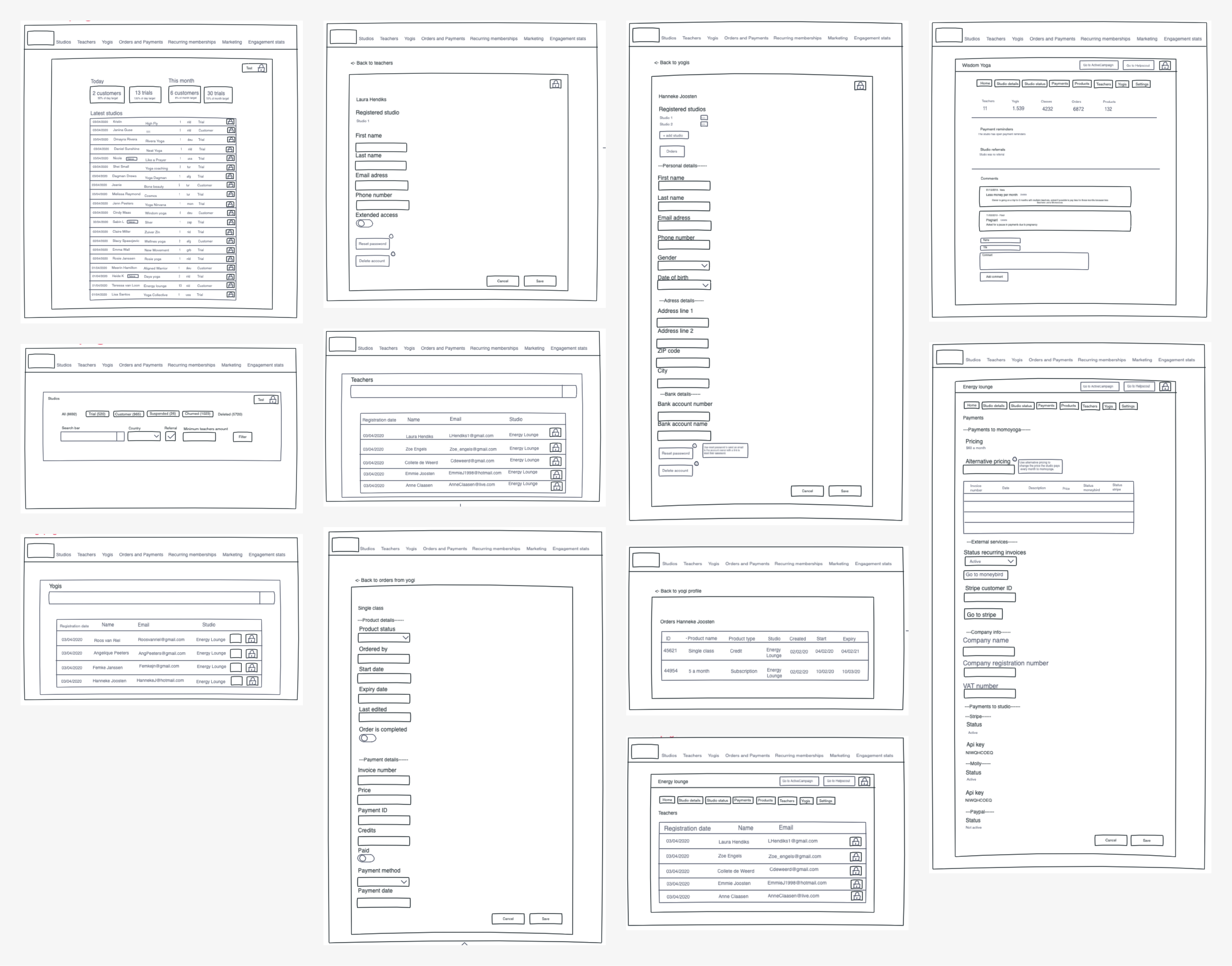
Using this gathered information, I started the design process, starting with wireframes and iterating based on feedback from the supervisor/UX designer. These wireframes evolved into a clickable prototype, which underwent usability testing with a sample of employees and external testers to ensure clarity and functionality for both groups. Underneath, you can see examples of the wireframes that were created.

After refining the prototype based on usability test results, I progressed to a high-fidelity design, collaborating closely with the UX designer to maintain consistency with Momoyoga's existing style. Next, meetings with developers were held to validate the design’s feasibility.
Upon finalizing the designs, a new clickable prototype was created and subjected to another round of usability testing, resulting in minor design adjustments and recommendations for further implementation.
04. End Results
Following the redesign, the developers planned to implement the new design for a future sprint. Momoyoga's focus lays on the software that the customer uses, so it is not of high priority to spend time on
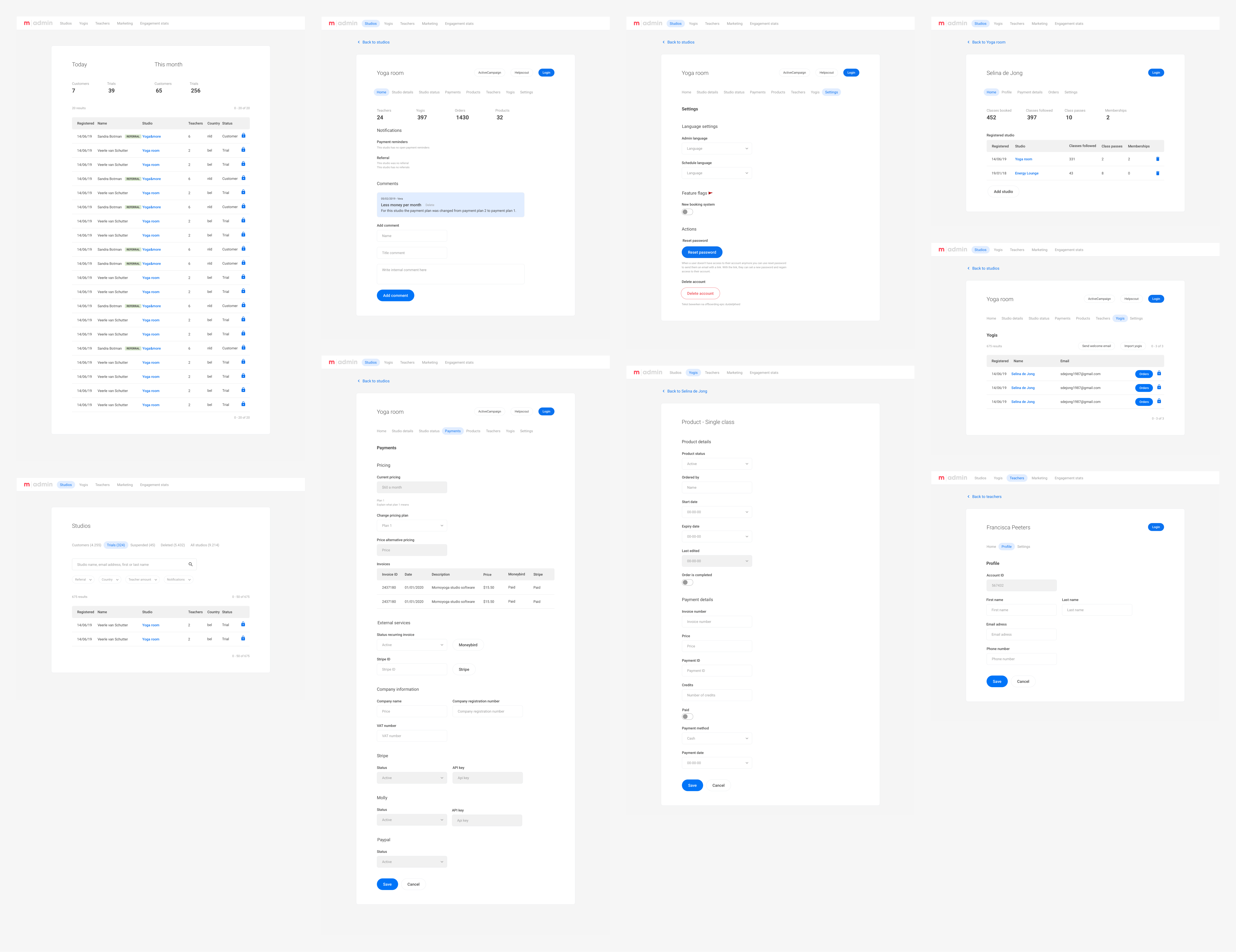
In the picture underneath, you can see screenshots of several end designs created for redesign.
