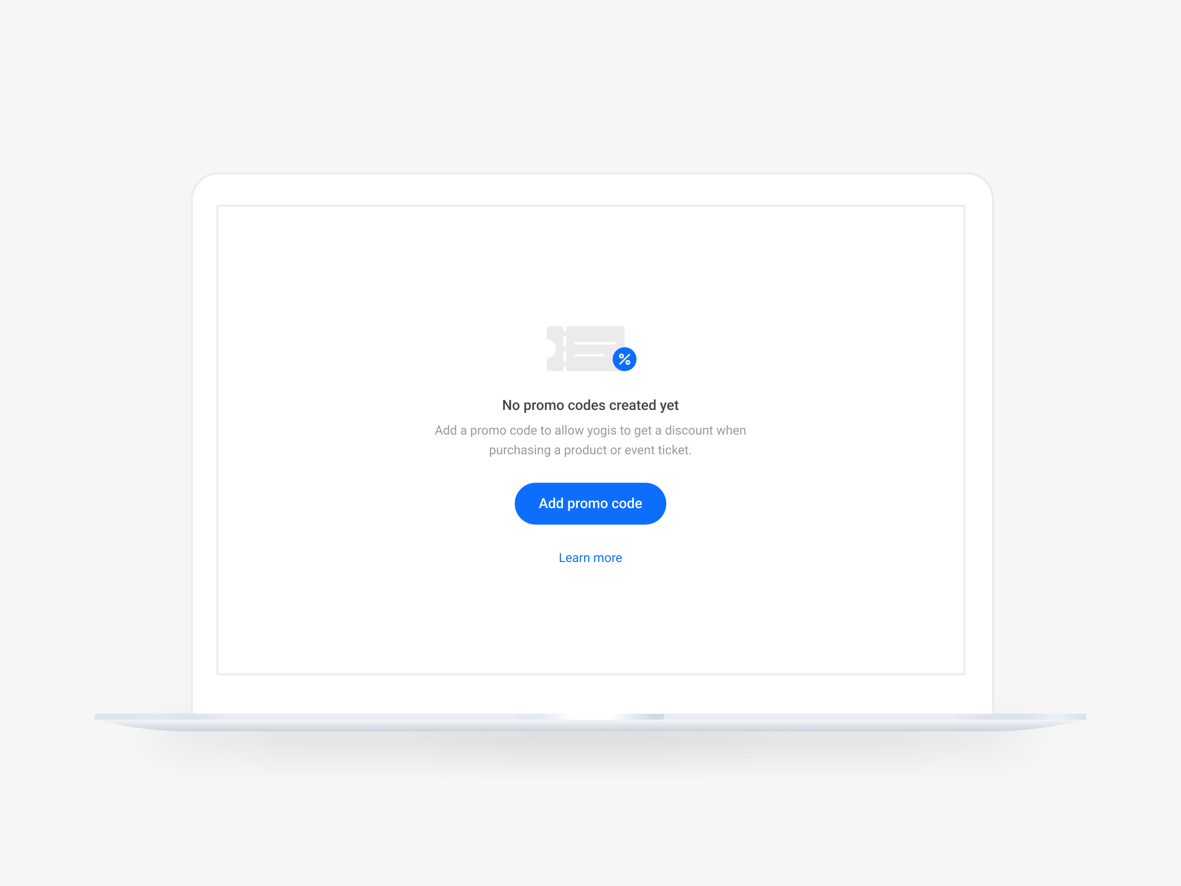
Promo Codes Feature for Momoyoga
Creating a new feature for Momoyoga's management software for yoga studios, focusing on the integration of promo codes for improved user experience and convenience.
Over a span of roughly three months, I dedicated my time as the lead designer on this project, working part-time. During this period, I regularly met with the head UX designer within the company for progress updates and feedback sessions. Additionally, I also met with the developers within the company to verify the feasibility of the designs.

01. Context
Momoyoga is a software company that creates a management platform tailored to yoga studios and teachers and their needs. The company uses its knowledge of the unique requirements of the yoga community to offer a range of features, including scheduling, client management, and payment processing. Their goal is to create an intuitive tool that helps yoga studios and teachers with administrative tasks so they can spend more time on the mat doing what they love. However, one function that was missing in their software was the option to create, manage, and use promo codes.
02. The Problem
The problem at hand was the absence of support for promo codes within the software. The absence forced Momoyoga's clients to resort to creating custom products and employing various workarounds, which caused them to be less efficient and carried risks regarding administration. Additionally, the feature was often a standard in competitors’ software, contributing to customer dissatisfaction and even loss to rival software. This made the implementation of the promo code feature imperative for company growth, customer retention, and reducing system complications arising from current workarounds.
03. Design Process
The design process for implementing the promo code functionality into the software involved a comprehensive approach to ensure alignment with user expectations, industry standards, and company values. To start, I looked into customer feedback to understand the needs and desires regarding this feature. This data provided valuable insights into the user’s expectations and the design’s pain points.
Following this, market research was conducted to benchmark competitor offerings and understand industry trends. I looked into how competitors implemented promo code features and analyzed the functionalities they included. Additionally, I broadened the research to include best practices in promo code implementation across various industries, drawing inspiration from, for example, clothing brands.
With a thorough understanding of user preferences and industry standards, I analyzed Momoyoga's software to identify all pages on which the promo code feature could and/or should have an effect. This included not only the pages when ordering a product but also administrative pages, which helped prevent problems later on for both Momoyoga's customers and their yogis.
Next, initial wireframes were designed, serving as a foundation for the design process. These wireframes underwent multiple review sessions with the lead designer and the company co-owner, fostering collaboration and refinement of design concepts. Iterations were made based on feedback, with particular attention to the feasibility of implementation. The developers were also included early in the process to assess technical constraints and possibilities.
Upon finalizing wireframes, high-fidelity designs were created within Figma that maintained consistency with the existing style and language of Momoyoga's software. Simultaneously, the designs were prototyped within Figma to simulate user interactions, validate design decisions, and prevent possible issues.
Throughout the design process, feedback loops were established with stakeholders, including designers, developers, customer success, and yoga teachers. Multiple rounds of feedback and iteration ensured that the designs met both user needs and technical requirements. After approval from all stakeholders, the finalized designs and prototypes were handed over to the development team for implementation.
04. End Results
Following the redesign, the developers implemented the new design within the software. Next, informative content, including a help center article and inspirational blogs, was created to showcase the possibilities of the new function to the new customers. The responses from the customers were very positive, with many testing and using the feature straight after release.
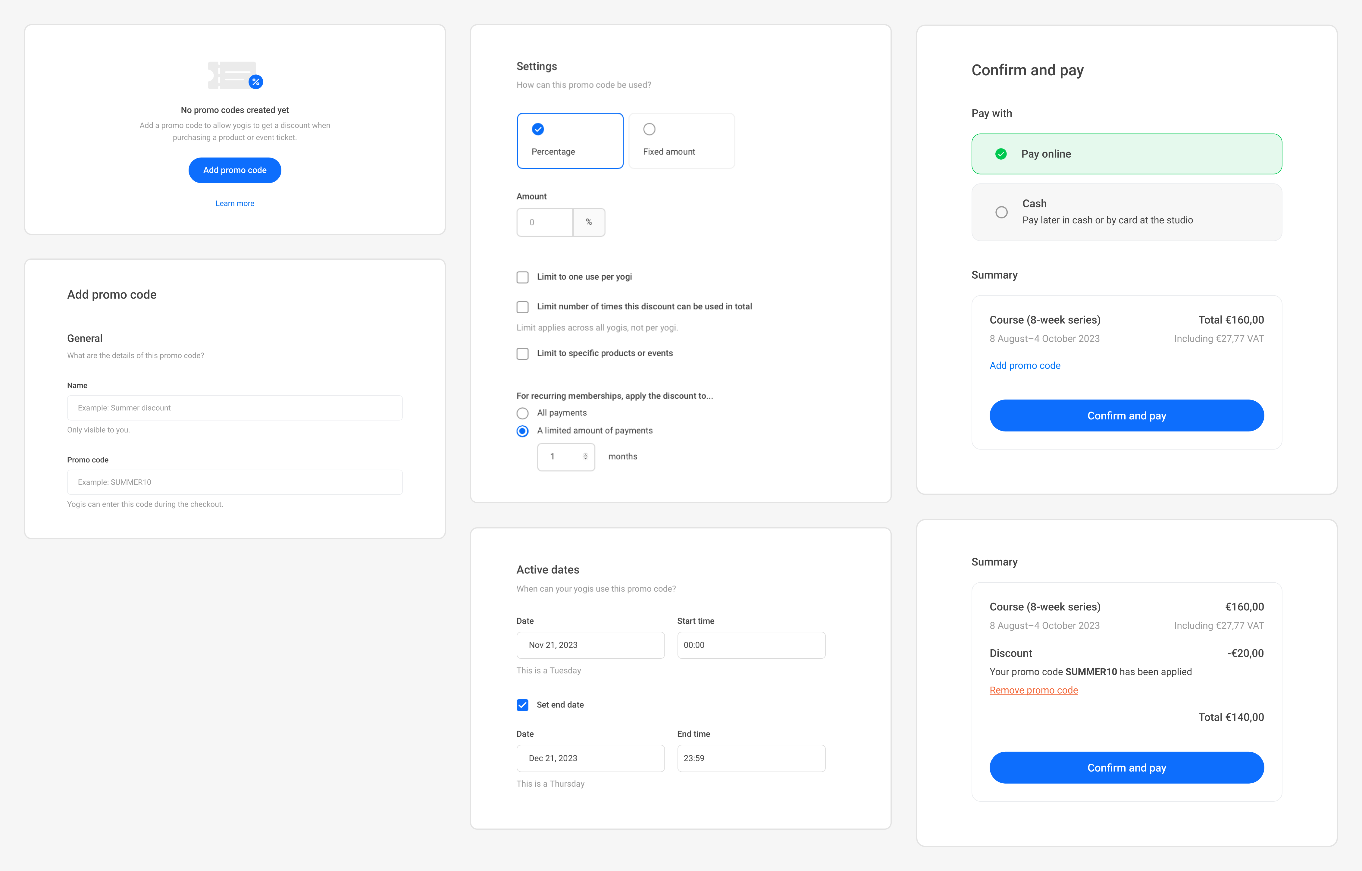
In the picture underneath, you can see screenshots of several end designs created for the new feature.
